
When the Brand Lags Behind the Business: Rebranding Our Learning Loft.
Kenneth T.
There's a particular kind of client that makes the best work possible. Not the ones who know exactly what they want — those projects often end up conservative, safe, the brief fulfilled and nothing more. The best projects come from clients who know exactly who they are, but haven't yet found the language to show it. The brand is lagging behind the reality. The work is to close the gap.
Our Learning Loft was that kind of client.
OLL has been running boutique tuition in Singapore for years. Small classes — four to six students. Curriculum-aligned teaching, tracked to each student's specific school syllabus, not a generic programme. Tutors who operate more like mentors than instructors. A genuine philosophy: that confidence matters as much as grades, that curiosity is an outcome worth designing for, that the environment in which a student learns shapes how much they're able to learn at all.
None of that was reflected in how OLL looked or sounded. In Singapore's tuition market, the dominant visual language is clean, confident, and results-focused. It speaks directly to parental anxiety. It works. But it made OLL indistinguishable from the kind of centres that are its philosophical opposite — large, transactional, one-size-fits-all. Our job was to build a brand that told the truth about them.
The idea before the identity.
We started where we always start: with the question of what makes this genuinely different. Not the features — the small classes, the curriculum alignment — but the feeling. The experience of being an OLL student versus being a student anywhere else.
What came back from those early conversations was consistent. Students felt safe. They asked questions they wouldn't ask in school. Parents described it as the first environment where their child actually wanted to show up. Tutors talked about their students the way coaches talk about athletes they believe in.
That became the foundation. OLL isn't a tuition centre. It's a learning studio. And the brand needed to say so.
Where Learning Feels Like Home — the line that anchored the new identity — wasn't written in a brainstorm. It was already there, in the way the OLL team described their own space. We found it and made it permanent.
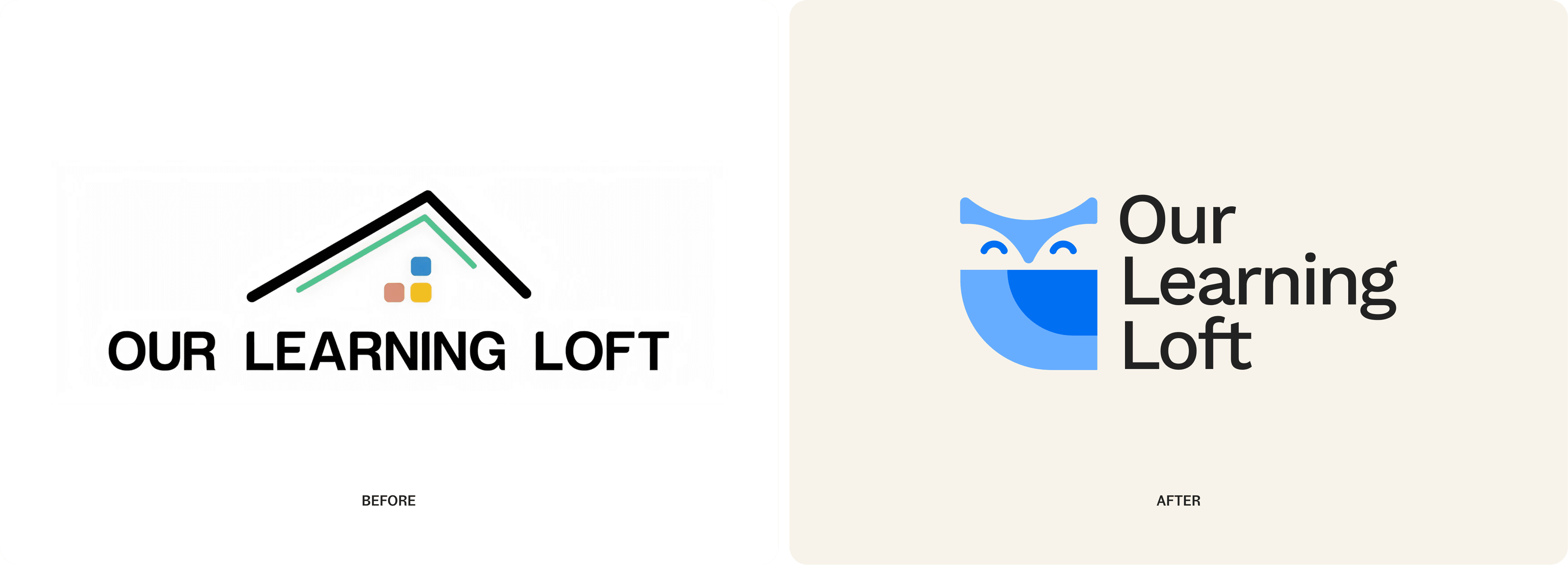
The Mascot
One of the most distinctive decisions in this project was introducing a mascot — something relatively uncommon in Singapore's education sector, where brands tend toward the institutional.
The owl made immediate sense. Wisdom, curiosity, a quiet watchfulness — those qualities mapped directly onto what OLL's tutors were already embodying. But we didn't want a generic owl. We wanted a companion. The owl mascot - geometric, clean, expressive without trying too hard -- designed to sit quietly across every touchpoint without demanding attention.
The rationale was simple. Singapore's education market is serious. OLL's differentiator is that they're warm, human, and genuinely encouraging. A well-designed mascot communicates that before a single word is read.
What we delivered.
A complete brand system: strategy, identity, voice guidelines, logo system, colour and type, iconography, photography direction, stationery, social media templates, centre signage, and a Framer website identity.
Since the rebrand, Our Learning Loft has grown their social following 3x and established themselves as the dominant tuition brand in their neighbourhoods. The work wasn't decoration. It was a business asset.
See the brand in action at ourlearningloft.com.